
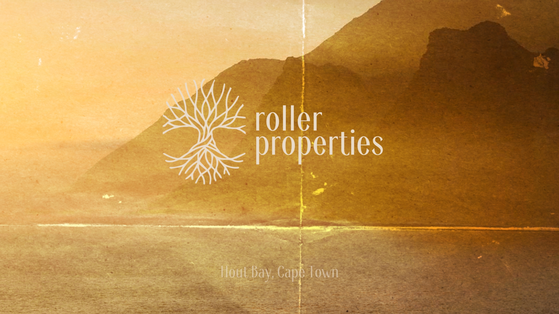
A holiday in South Africa. A chance meeting in Hout Bay. A small real estate business that just wanted a logo — and got a whole brand experience instead.
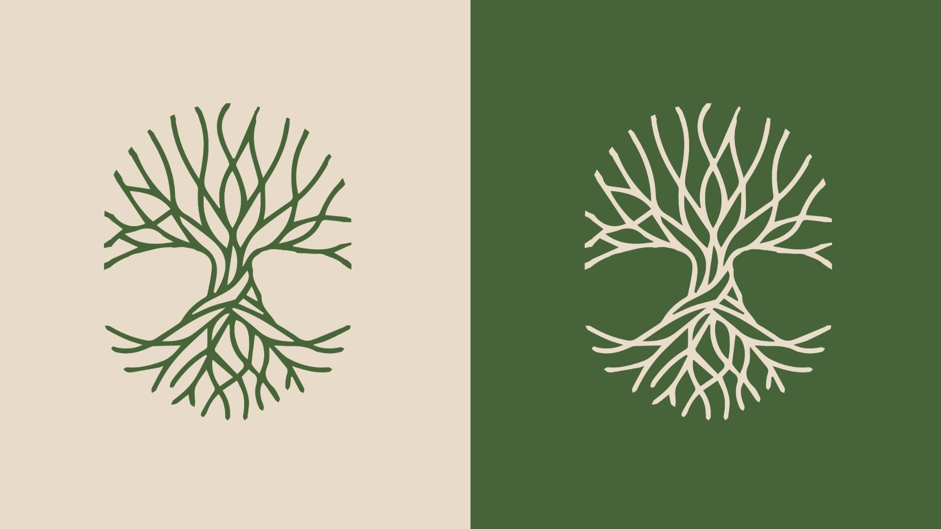
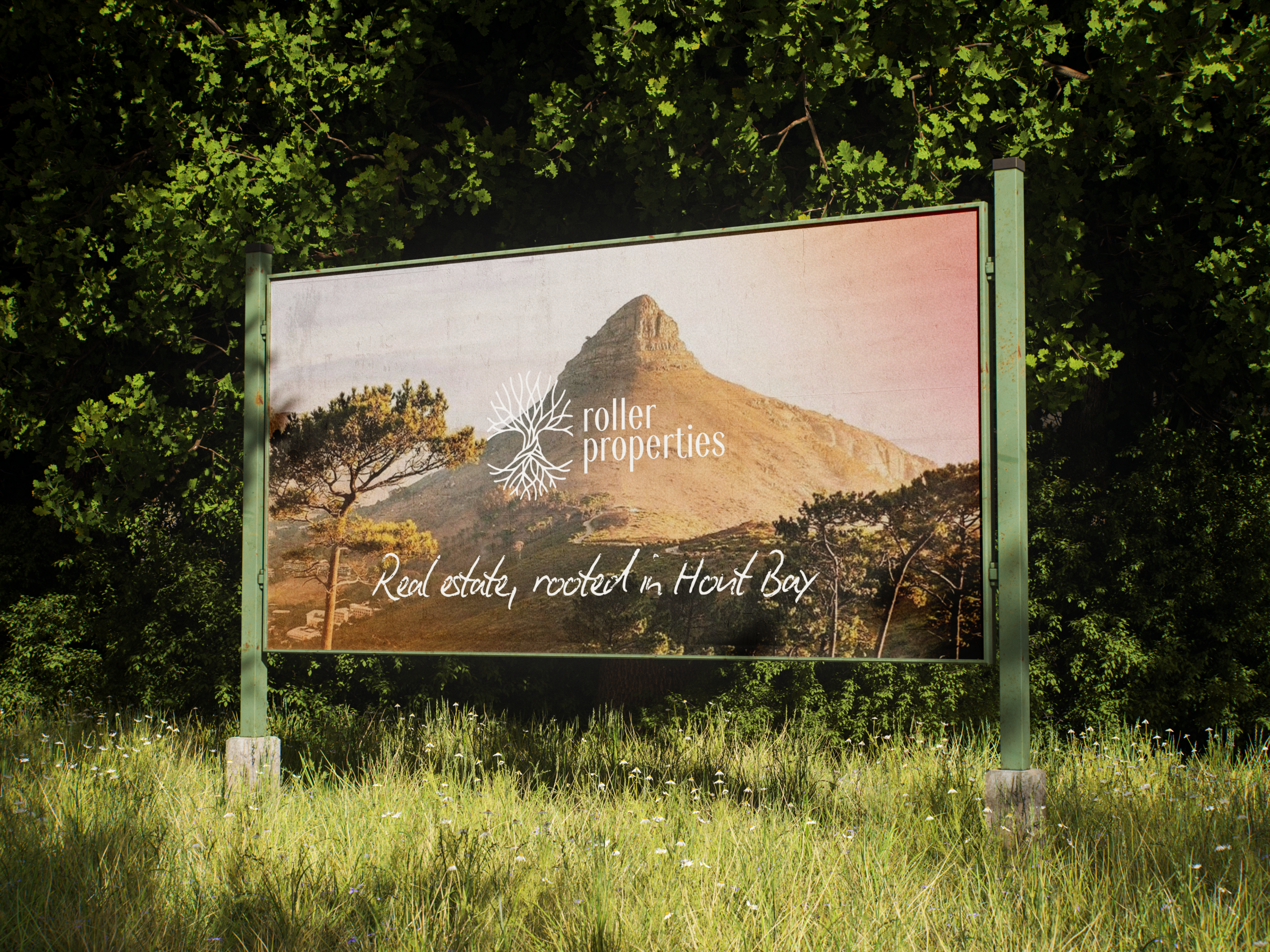
The logo takes the shape of a tree of life, its roots and canopy mirrored into a single circular form. The organic, hand-drawn linework nods to the baobab — an ancient symbol of endurance and shelter across the African continent — while the earthy green ties the mark back to Cape Town’s natural landscape.
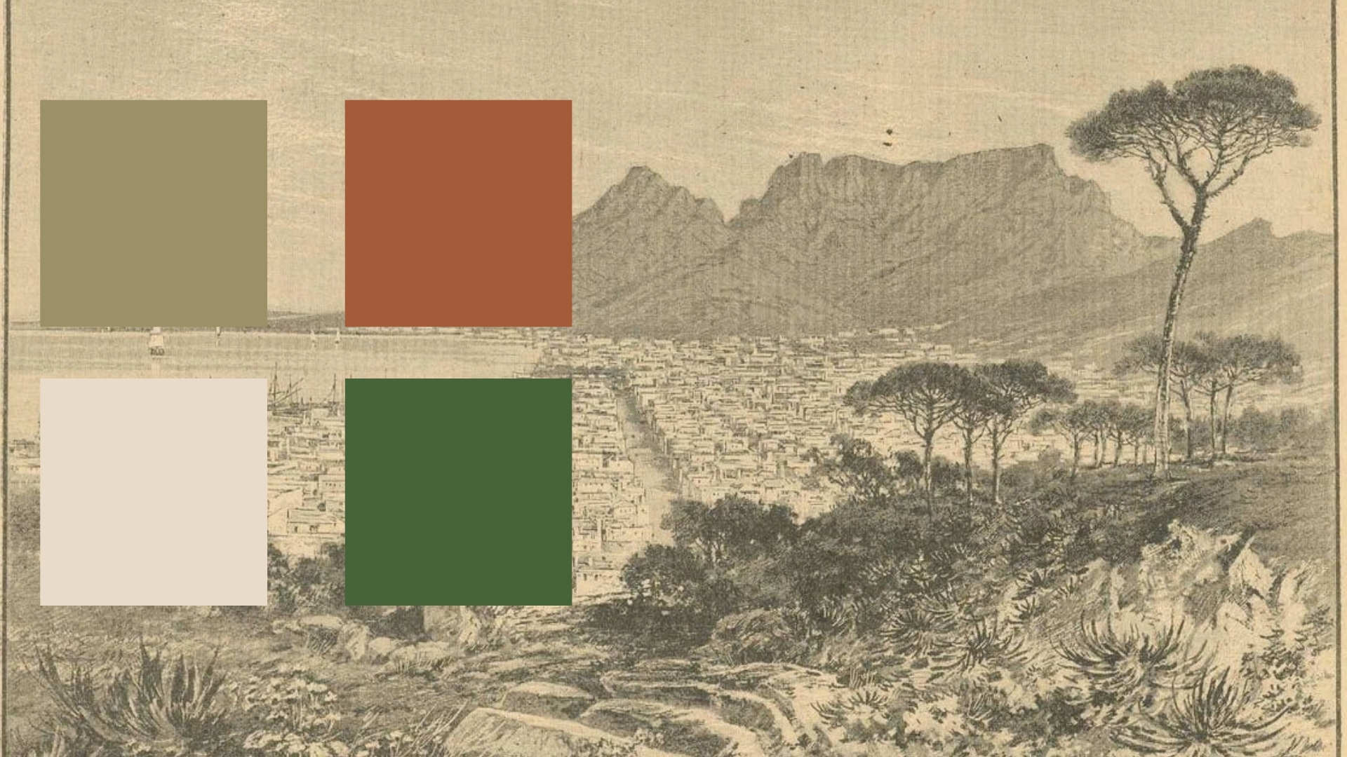
The colour palette is earthy, drawing inspiration from Cape Town’s lush green scenery and the breathtaking sunsets over Hout Bay.
Ready To Create Together?
Services
Brand Identity
Web Design
Creative direction
Content Creation
Digital Marketing
Contact
kalli@vithocreative.com
Studio
Around The World
Copyright © 2026 Divi. All Rights Reserved.